If you’ve ever wondered: What is a landing page? How do they work? And how can I create one that works for my business? In this post, we’ll answer all those questions and more!
Landing Page Defined
In the simplest terms, a landing page is a page on your website that’s designed to convert visitors into leads. That means the main goal of a landing page is to collect a visitor’s information through a lead form.
It may sound like all you need to do is add some form fields and call it good, but there are several key components you should include when building a successful landing page to ensure it converts visitors into leads.
Now that we’ve defined what makes up a landing page, let’s dive into some examples of various types of landing pages.
Landing Page ToC
How do Landing Pages Differ From Other Types of Web Pages?
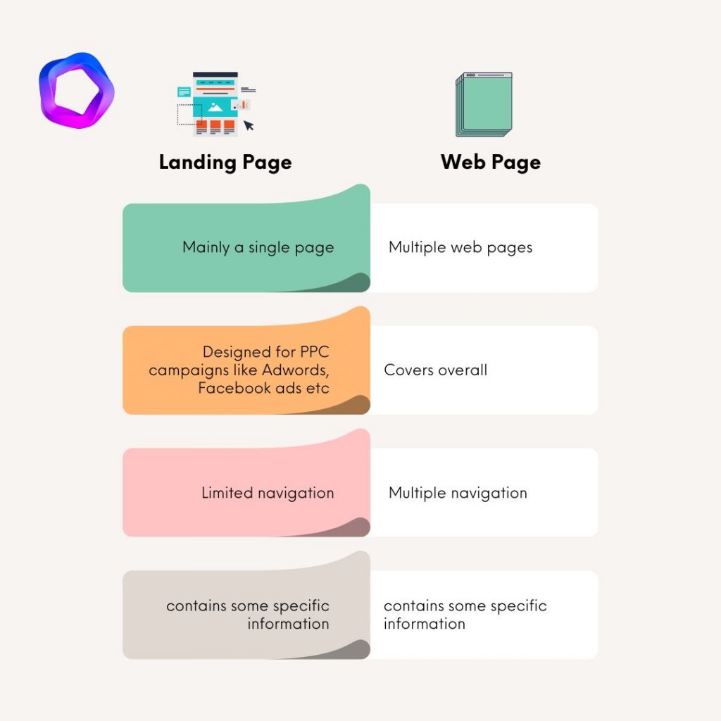
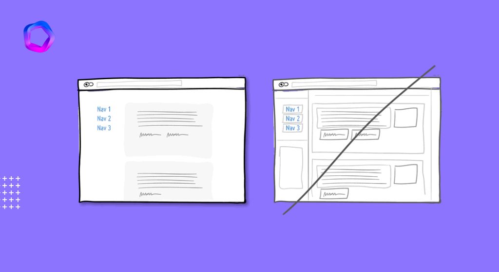
The main difference between a landing page and other types of web pages is how they are used. Landing pages are aimed at visitors who are looking for very specific information. A landing page contains only the information a visitor needs to make a decision, so there’s no option to navigate away from it.
When you create an AdWords campaign, you normally choose one of your existing website’s pages as the destination URL. This is fine when your business has many different products or services, but if you’re advertising specific information about only one product or service (for example, details about an offer or promotion), it can be more effective to send people directly to a landing page that’s focused on that information alone. That way, visitors can easily find what they’re looking for and won’t get distracted by other parts of your website.
A landing page is often the first thing a visitor sees when they click on your campaign — so make sure yours is designed to convert!
The Three Main Types of Landing Pages and When to Use Them?
While there are far more than four types of landing pages, they typically fall under one of these main categories.
Click-Through Landing Pages
Click-through landing pages are also known as lead generation landing pages. The purpose of a click-through page is to get people to click through your website. They’re used to collect contact information from a visitor in exchange for something promised on the page, such as a free eBook, white paper, or product demo.
Sales Landing Pages
Sales landing pages are dedicated to selling products or services online and help raise conversion rates for ecommerce stores by focusing the user’s attention on a single call-to-action (CTA). Typically, sales landing pages will feature an image of the product or service being sold and include multiple sections that explain what it does and how much it costs.
Viral Landing Pages
Viral landing pages entice visitors with something that seems too good not to share: Usually a free gift such as an eBook, discount code, or infographic. To access the gift, visitors have to enter their email addresses and share the page on social media. Once shared, they can download their gift while marketers benefit from collecting leads through social media referrals in addition to organic traffic.
How to Create a High Converting Landing Page?
Make your headline compelling.
The purpose of a headline is to make your potential customer stop and read. The better the headline, the more people will read your landing page. People are busy, so you have to demand their attention right away. The best landing page headlines promise an immediate benefit or reward for reading further.
Here’s how:
- Don’t write long headlines. Ideally, you should aim for five words or less in your headline; if you need more words than that, split it into two lines, or try to use a sub-headline instead.
- Don’t try to be too clever with your headlines — keep things clear and straightforward as much as possible. You want people to understand what they’re getting from the product before they even start reading and not be confused by any unclear language or directions contained in the headline itself.
- Use the word “you” instead of “I” or “we.” This makes it sound like you’re speaking directly to them instead of just trying to sell them something while they’re scrolling on their phone during their morning commute.
Be specific and make promises in your subheadline.
Don’t make them wait.
Your Subheadline should expand on the promise of your headline. Use this space to explain what the product is, how it works and why it’s important.
You can also use your subheadline to state the value that you’re offering in more detail. For example, a headline like “Create an Email Marketing Campaign” would have a subhead that states “Drive clicks and conversions with our free email marketing tool,” or something similar.
Another way to use a subhead is to make a promise of what the customer will get out of your product or service. You can even present them with options. A headline like “Get Rid of Pesky Pests” would be followed with a subhead that reads “Hire us for pest removal services or purchase our pest control products.”
Explain your vision with a video
Including video on your landing page is a great way to give viewers a glimpse into the world of your brand and product. According to iMedia Connection, making effective use of video on your e-commerce site can increase conversion rates by as much as 86 percent.
When it comes to creating videos, you can take an educational route and do something like a “how-to” or “behind the scenes,” or you could create something that’s more sales oriented.
In either case, you should keep it short and sweet—no longer than two minutes—and explain why people need your product or service. You should also talk about how your offering solves their problems and what sets you apart from competitors. Use case studies and testimonials whenever possible so customers can see how others have benefited from working with you in the past.
Use descriptive images that illustrate your value proposition.
Organize your content into easily digestible sections
A reader should not have to spend a lot of time looking at one section of your web page to find out exactly what’s being conveyed. You can avoid this problem by organizing your content into easily digestible sections with headlines, subheads and bullet points.
The right design and content principles
It’s easy to think that only famous brands with massive marketing budgets can create successful landing pages. While it is true that those companies’ landing pages may be especially impressive, in reality, anyone can create a high-converting landing page if they follow the right design and content principles. Here are some of the most important dos and don’ts:
15 High-Converting Landing Pages
1. CommonCraft
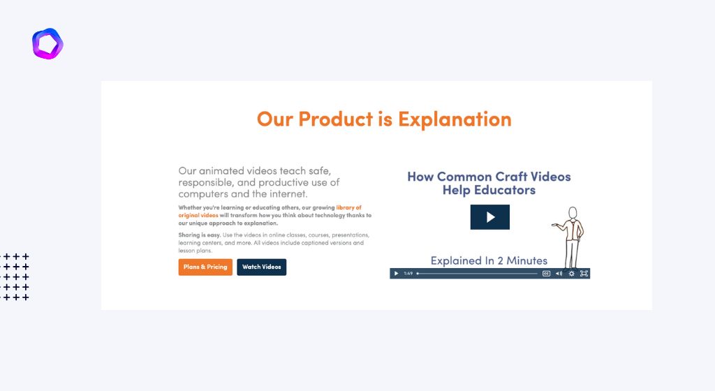
This landing page does everything right in terms of design and copy; its unique visual style, clear explanation of the product benefits, and clear explanation of how it works combine to make a great user experience.
This page knows exactly what people are looking for when they arrive at it, and it delivers. It’s also incredibly easy to navigate: there is no question about what you have to do or where to go next as a visitor. There are two buttons that clearly call you to action on either side of the screen. At the bottom, three more buttons entice you to keep exploring this wonderful site.
2. Uber
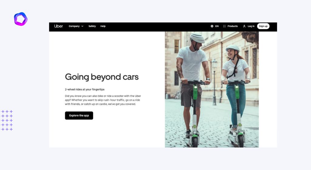
Uber’s landing page is clean, simple, and to the point. They have a clear headline: “Going beyond cars?” They’ve then taken that a step further by showing you how the bike service works through an easy-to-follow image.
Next comes their CTA: “Explore the app.” Below that section, they make it easy for visitors to see if Uber has expanded to their city by adding a few search boxes asking them where they’re going and where they’re coming from. Finally, they end with social proof of how great their service is by adding some testimonials from happy customers.
3. The Hustle
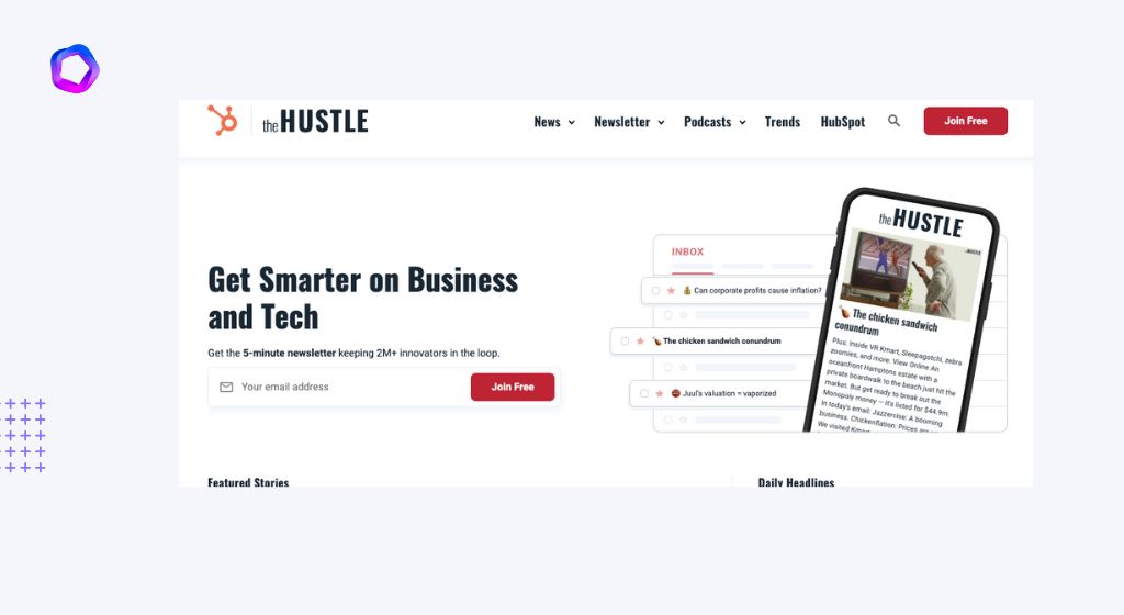
This page is a masterpiece. The clean, simple design and plentiful white space make it easy to follow the logical progression of information down the page. This is one of the best examples you’ll find of a landing page that’s all about benefits, without ever talking down to its users.
You may notice that there’s no navigation on this landing page, which means it only exists to serve as a conversion funnel for The Hustle’s email list. But what really stands out here is the value proposition: “How tech’s top investors see the world.” If you’re someone who wants to know how they think—and by extension, how to invest and spend like them—then you’re primed for conversion.
The CTA copy—”I want in”—is clear, concise, and aligned with the brand voice of The Hustle. It reads as an exclusive invite (“in” indicates membership), which makes it even more appealing to sign up for their newsletter (or “email experience,” as they call it). They’ve also included an incentive: You get $50 if your friend joins up after clicking your referral link—a nice extra touch that doesn’t clutter the page with too many elements.
4. ProProfs Quiz Maker
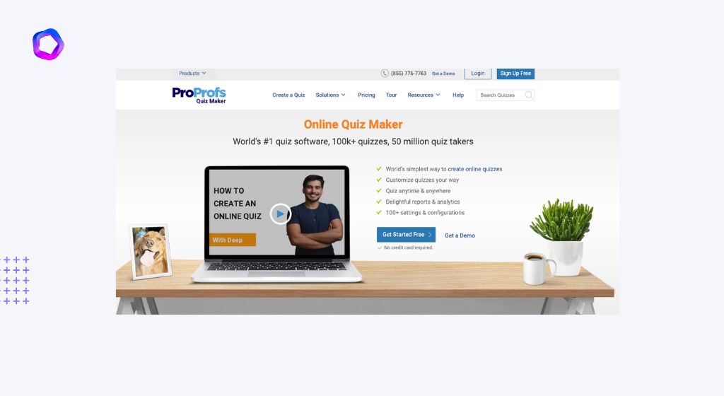
What it does: This page explains what ProProfs Quiz Maker is and how it can help you increase your conversion rates.
Why it works: This landing page is an excellent example of copywriting. It starts out with a strong attention grabber, then gives readers a reason to keep reading. It also reveals the benefits of this service in a way that’s clear and compelling, so people will want to take action right away.
It’s also easy to scan, which makes it easy for visitors to hop around to find the information they want while still giving them all the information they need.
Takeaway tips: On this landing page, you’ll see several design techniques in action:
- An attention-grabbing headline
- A clear call-to-action button
- A short video showing how ProProfs Quiz Maker works (Note: This video doesn’t autoplay when you first load the page)
5. LambdaTest
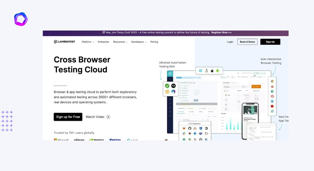
This landing page does a lot of things right. Here are the most noteworthy:
6. Creative Bloq
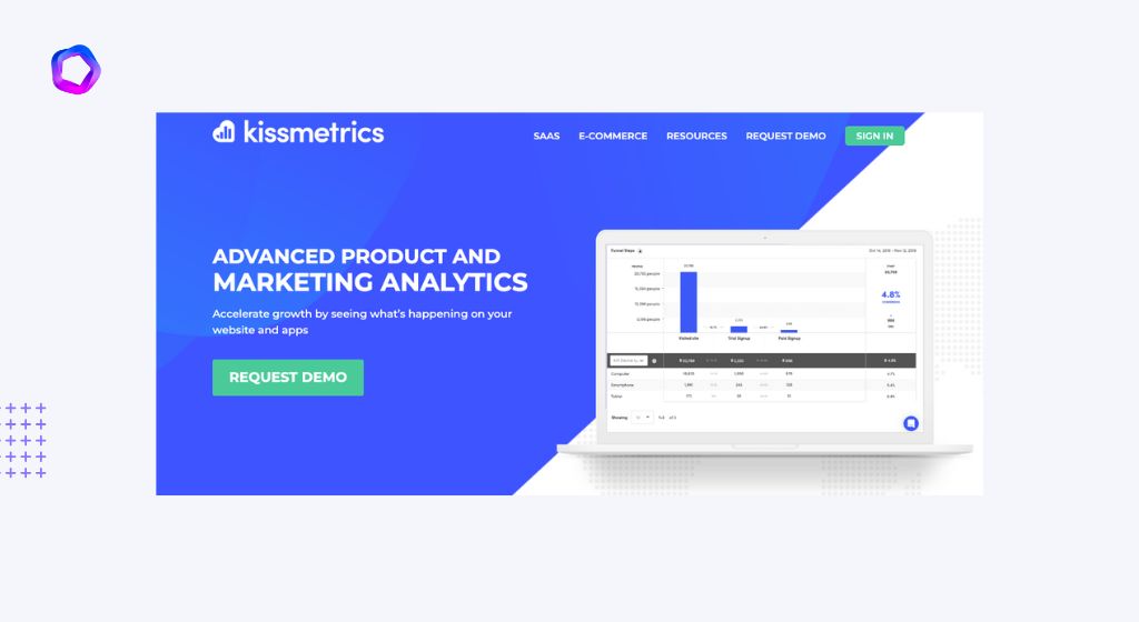
7. Kissmetrics
8. Woorank
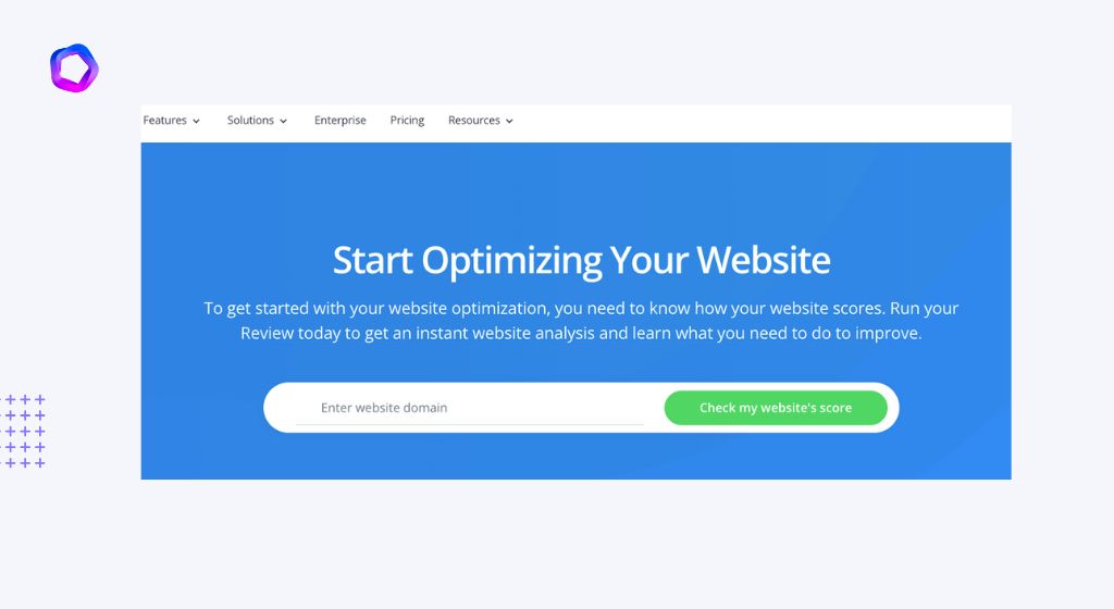
This landing page from Woorank is a great example of a simple, distraction-free landing page—especially in its desktop version. The goal here is clearly to get you to check your website score—and you’d be hard-pressed not to click that big green button after scrolling through this.
Woorank’s animated arrows pointing to the CTA help enhance the feeling of immediacy and urgency—and by showing you where they want your eyes directed next, they help nudge you down the page with their scroll hinting arrows.
9. Brikk
When it comes to luxury products, less is more. Brikk features minimalist design that immediately catches your eye—and then holds it. There’s no sidebar navigation, no questions and the only call-to-action is at the very bottom of their page.
The design is simple: a white background and a single image at the top of their page with some text on it. There’s not even any information about who made the site or what they sell. This puts all focus on the product itself and makes you wonder what else Brikk offers (if you didn’t know that already).
10. Moz
Moz’s landing page is a great example of content-focused design. The page is visually striking, but the emphasis is clearly on the content, not on the design.
There are only three things to see on this page: an image of the book, a headline and some text. Even though that sounds simple enough, there’s a lot happening here:
The image of the book has been used to bring life to what could have been a relatively boring piece of content — it’s also there to pull curiosity from potential customers who want to know how they can become better marketers themselves.
The headline uses key phrases like “free,” “easy” and “online.” These phrases resonate with potential customers because they offer solutions to two common problems that marketers face: time and money. Since Moz is giving away their product for free (and online), it capitalizes on both those points.
Below the headline, Moz offers even more value by explaining exactly why their guide will help you. Each bullet point builds upon the last one by offering more information about what you’ll get if you download their guide — this helps build trust in their brand while also keeping visitors engaged with its short-but-informative copy.
11. Lyft
The first thing that stands out about this landing page is its simplicity. The visual hierarchy of the content is clear and to the point. The background image draws your eye right to the one CTA button on the page: “Ride”.
There’s a lot of social proof going on here, too. Lyft uses customer reviews and a strong case study to get their message across—no need for a long-winded sales pitch when you can just let your happy customers do it for you!
I love how they even incorporated their brand name (the pink mustache) into their headline. Their company identity was woven into every aspect of this landing page in a way that makes anyone who sees it feel like part of an exclusive club.
12. Bidsketch
The Bidsketch landing page keeps things very simple. There’s a simple headline, an image of a person creating a proposal, and a single call to action (CTA). There’s also a clear value proposition—that the tool can help you create professional proposals that get signed faster.
The page is easy to read, with lots of white space and colors that are easy on the eyes. The CTA stands out from the rest of the page so visitors know exactly where they need to click if they want to try out the product.
Simple is usually better when it comes to landing pages because you don’t want anything distracting your visitors from taking action (in this case signing up for Bidsketch).
Inspiration for landing pages
There are five key elements that make a landing page high-converting:
- Headline: The main headline should be clear and direct, enticing visitors to want to learn more.
- Value proposition: With a value proposition, your goal is to explain what the visitor will get out of using your product or service.
- Call-to-action (CTA): The CTA is an essential part of any marketing campaign. It should be benefit oriented and offer social proof if possible.
- Visuals: In some cases, less is more when it comes to visuals on your landing page—a clean design can help guide the visitor’s eye to the most important parts of the page. That said, visuals are vital for marketing anything online. People are visual creatures, and we equate poor design with poor products. Everything from popups to images and everything in between should be geared towards making the user experience enjoyable and increasing conversions.
- Social proof: If you’re looking to increase conversion rates, adding any sort of social proof, whether testimonials or customer reviews will go a long way in helping you achieve your goals. To create this landing page template yourself, just sign up for a Free 30 Day Trial with Unbounce
The Benefits of a Landing Page
It can increase the conversion rate
Your landing page is the first impression that a visitor gets, so it’s the most important page on your website. Improve your landing page, and you’ll see improvements in conversion rate.
You can build trust by giving people clear, relevant information about your business and making it easy for them to navigate the rest of your site. You can include a Frequently Asked Questions section or highlight customer testimonials to support their decision-making process.
It can boost your search engine optimization (SEO)
A landing page is a great way to boost your search engine optimization, or SEO. The term “SEO” refers to the process of getting your website ranked higher on search engines like Google, Yahoo and Bing.
You might have noticed that when you do an online search for something, you almost always click on the first result that shows up—you rarely take time to scroll through pages of results. This means that if you want people to come visit your website, it has to show up first in their search results. So how do you get there? You need good SEO!
There are two main types of SEO: On-page and Off-page. On-page refers to any action taken “on” your website, while off-page refers to any action taken elsewhere (such as social media) that will impact your site’s ranking. There are several things that can negatively and positively affect both forms of SEO.
It can help you get qualified leads
Here are some benefits of landing pages:
- They can help you get qualified leads. Since your visitors will be expecting to see a registration form, they already know why they should enter their email, name, and phone number. This makes it easier for you to gather information from them.
- You can get more sales. If the purpose of your landing page is to promote a product or service, then it’s likely that you’ll get more sales because the visitor doesn’t have any distractions on the page (e.g., navigation menu).
- You can gather emails and build your list. A landing page is an effective place where you should put your email opt-in form so that you can build your mailing list in no time.
- You can build your social media following. If you want to increase the number of followers on Twitter or Facebook fans, then create a landing page where visitors can click on the “Follow me on Twitter” button before downloading an e-book or PDF file from your website in exchange for their contact information or subscription fee (if applicable).
- You can drive traffic to other pages and posts on your site. Strategically using links within the content of your landing page will let visitors know about other products and services offered by you company and other important content available on your site—without losing any possible conversions (e-book downloads, sign-ups for webinars, etc.).
7 Landing-Page Tests to Drive More Conversions
Use the 80/20 Rule
When it comes to conversion, there is an important rule you should follow: the 80/20 rule. This rule teaches us that often 80% of our conversions come from 20% of our traffic.
What does this mean?
It means that if you want to improve your conversion, you need to focus on the 20%.
This might be a bit difficult for some of us. We are used to focusing on the 80%, which for most of us is our total website traffic. It’s relatively easy and straightforward because we don’t have to segment it or dig deep into the data.
Here are a few tips for how you can follow the 80/20 rule when setting up landing page tests:
Test one thing at a time
You can test several variables or only one variable depending on how many resources you have available, but always test only one variation of each variable in each test. By doing it this way, you will know exactly what caused any change in performance that shows up in your results. If multiple changes show up in your results, then it will be very difficult to determine which change was responsible for which result.
Leverage Testimonials
Testimonials are one of the most powerful tools for building trust. With a testimonial, you can leverage the experiences and words of your customers. A testimonial can be a sentence or two, but it doesn’t have to be. Testimonials can take many forms and formats—videos, audio snippets or text-based quotes with the name and image of your customer.
When adding a testimonial to your landing page, consider its placement carefully. If you’re including images, make sure they’re aligned with the rest of the content on your landing page for optimal results—unless you purposefully want them to stand out from everything else!
So when does it make sense to include a testimonial? When any time someone says something great about your product or service that would help build trust in the eyes of prospects!
Keep it Simple
Optimize for Mobile
One of the best ways to improve your landing page is to optimize it for mobile. With more and more people using their smartphones and tablets, doing so will drastically improve the experience for users who visit your landing page from those devices.
Here are some tips:
- Ensure that you have a responsive design in place. This will ensure that your page adapts to whatever screen size it’s being viewed on.
- Test how quickly your page loads on each device at different connection speeds (Wi-Fi, LTE, etc.) If the load time is poor, consider optimizing elements like images by compressing them or using a CDN (content delivery network) if you don’t already do so. These steps will help reduce the file sizes without sacrificing image quality.
- Make sure that all elements of your landing page are easy to navigate with a finger on a small screen as opposed to what may work well with a mouse pointer.
Strong Calls-to-Action
Above the Fold vs Below the Fold
You’ve probably heard the phrase, “above the fold.” In terms of a landing page, it refers to the area visible without scrolling. To test what works best, you can try adding more information below the fold or condensing your landing page so all pertinent information is above the fold.
Amazon offers an excellent example of this with its Kindle Fire product page. At first glance, you know exactly what you’re getting:
An image of the productA headline that clearly states what it is (Kindle Fire)A subheadline that goes into more detail about specific features (Powerful 7″ tablet with latest generation processor)Three reasons why you should want this productTwo buttons for instant action: Buy now and Learn more
Prioritize Speed
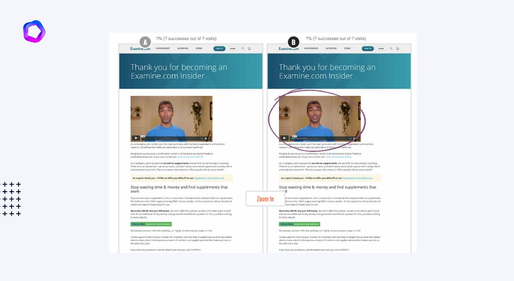
You can run A/B tests to optimize your landing page for conversions.
A/B testing, also known as split testing, is a method of testing designed to discover the best version of a page for encouraging your visitors to convert.
To be clear, A/B testing isn’t a new concept, but it’s still something that many businesses struggle with.
Of course you can run A/B tests to refine the copy and layout of your landing pages in order to improve conversions, but what about other elements on your site? Can you use A/B tests to optimize those pages as well?
Landing Page Testing Tools to Save Your Conversion Rates
Instapage
Instapage is an online tool that allows you to build a landing page in minutes. It’s simple to use, with a drag-and-drop interface and tons of templates to choose from. Instapage’s platform includes a lot of tools for building your page, including fonts, images, buttons and more. The coolest thing about Instapage is its A/B testing tool: It can create multiple versions of your landing page so you can figure out which one works best for you!
Unbounce
Unbounce is a tool that lets you build landing pages without having to code—even if you are not a developer. It offers more than 80 templates and allows you to customize your page with its drag-and-drop editor. Unbouce also offers several other tools, such as dynamic text replacement (DTR). DTR lets you change your copy depending on the keywords users use on search engines, so they always land on the right page.
You can try Unbounce for free for 30 days, and then it costs $79 per month.
Leadpages
Leadpages is a tool that was built with one goal in mind: generating leads. This tool allows you to create landing pages, alert bars, pop-ups and alerts in the fastest way possible. It comes with over 150 beautiful templates that are mobile responsive, which means your visitors will be able to view your landing page just as beautifully on their phone as it would appear on desktop.
If you’re looking for a simple drag-and-drop page builder that’s geared toward marketers (not developers), Leadpages is the tool for you. To start using this service, all you need to do is paste the Leadpage WordPress plugin code into your website’s header or footer. Once it’s set up, you’ll be able to quickly create and publish new landing pages from within your WordPress dashboard without ever leaving your site.
KickoffLabs
KickoffLabs is a landing page tool that offers a variety of features to help you save your conversion rates. Its features include:
The best part is that KickoffLabs is free to use.
OptimizePress
With OptimizePress, you can create landing pages and sales pages on your website that are optimized to convert visitors into leads. This is a WordPress plugin that provides you with an easy-to-use drag and drop page builder, as well as more than 30 templates for your web pages.
It also has a membership site builder, that allows you to create different levels of access for members to your site. You can also add in the blog feature if you want to use it as part of your website. The biggest benefit of OptimizePress is its integration with all major email services such as Infusionsoft and MailChimp.
Hopefully this article has helped you understand what a landing page is, the difference between a landing page and other web pages, and how to create one. Your next step is to start creating your own landing page!